Skip to content
 A brand refresh for Rising Ground coffee
23 January 2023
I think it's fair to say we had fun working on these new labels and bag designs for our pals over at Rising Ground coffee. When a brief comes in that asks you to combine the aesthetic of 70s Patagonia artwork with a punk 'zine feel, it sends you off down rabbit holes you never would have expected.
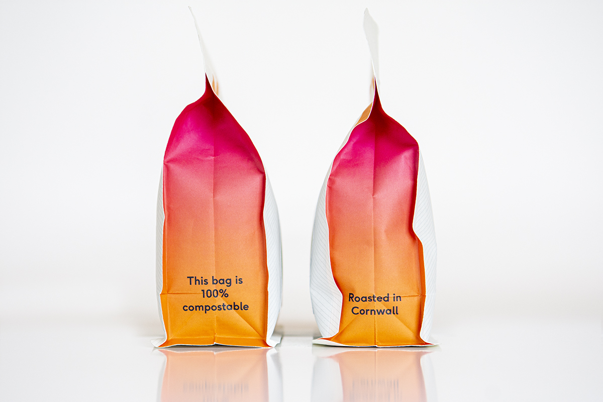
Wanting to break away from the Kraft paper brown coffee bags of old, Sean and Hugo wanted something punchy that had more shelf presence.
The graphic elements of the label design are made out of gaffer tape and Letraset lettering as a nod to the punk DIY ethic, while the colours are very much influenced by that 70s Patagonia look.
Foundry is the company's flagship blend. We also created a series of labels that can be used for their seasonal range of single-origin coffees and their decaf. The bags themselves are all printed up with a fine pinstripe pattern in the background and a bright orange 'logo' stripe across the top. The sides of the bags have a vibrant gradient of orange and bright pink.
So yes, all in all we had a lot of fun with this project. Most of all Sean and Hugo are delighted with the outcome, which is of course the most important thing.
You can purchase Rising Ground coffee on their website - our studio practically runs on Foundry, so it's a good entry point.